In 20th century, color printing is for limited experts in printing and publishing businesses. But now everyone can enjoy colors with digital devices: camera, scanner, monitor and printer. That's why this has been a major issue; color management.
|
See the following images and you can see slight differences among devices but on the whole all apples are fine except one T-shirt on the left. That's the case you say something is wrong with color matching, which is what is called "mis-translation", color management failure. You must have used a wrong color profile "dictionary" in wrong color space, etc.
|
   
      |
    
|
The following images will lead you to find out what is going on inside color profile and how important to select and use proper color profile for print.
|
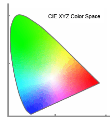
| This is CIE XYZ Color Space that expresses all colors inside the horse shoe area that a human can see. You may have seen this before in the catalogs of digital cameras, scanners and PC monitors.
|

| A green triangle shows the colors that sRGB can express, what is called "color gamut". A blue hexagon shows the color gamut of GT-782 and GT-541 CMYK inks.
As is often the case, almost all types of color gamut do not match each other and that's why you need to manage colors.
|
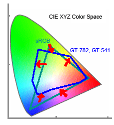
| See those red arrows. That is COLOR MATCHING is actually done.
We control printable colors with our color profile between sRGB and GT-782, GT-541 as well as GT-3.
You can see our red matches monitor red, but yellow is more vivid, green is wider, and purple and dark blue is poorer.
|
|
When you say "colors of a printer is well matched", this means precision and accuracy of color profile is done well. A printer can produce colors only within the color gamut. GT-3, as well as GT-782 and GT-541 never produce monitor brilliant Magenta on a white T-shirt, it is out of our color gamut.
|
Brother GT-3, GT-782 and GT-541 are all RGB printers under Windows printer driver system "UniDriver", which receives only RGB values with sRGB color profile from PC application. Therefore the best way to produce proper colors from GT-3 is to make artwork in RGB color space with sRGB color profile embedded. Mis-translation (mis-color-matching) surely occurs when the artwork made in CMYK color space is printed. Click here (If CMYK) how the color shifts.
|
But at the same time, even if the artwork is made in RGB color space, another type of mis-translation occurs when a different RGB color profile is embedded, e.g. Adobe RGB.
|
In RGB color space, RGB values do not change at all but the "absolute color values" L*a*b* values change. See the following dialogs (Photoshop CS), both colors are R=255, G=255, B=0 maximum pure yellow but L*a*b* values (and CMYK values too) are different. This function depends on the simulation of PC application.
|
Example 1: sRGB vs. Adobe RGB
Compare the process below when you want to fill an object in solid 100% yellow: it is very easy to see because your pure yellow might be printed with "dirty" dots.
|
| |
action |
RGB color mode with
"sRGB" profile |
RGB color mode with
"Adobe RGB" profile |
| 1 |
user's intention |
Maximum pure Yellow
|
Maximum pure Yellow
|
| 2 |
user's choice |
Yellow: R=255, G=255, B=0 |
Yellow: R=255, G=255, B=0 |
| 3 |
translation to RGB in application |
"sRGB" to "sRGB"
no translation |
"Adobe RGB" to "sRGB"
visible RGB values are the same but L*a*b* values shift |
| 4 |
Printer Driver |
RGB->CMYK
Yellow=100% |
RGB->CMYK
Cyan=0.09% Magenta=0.05% Yellow=88% K=0% |
| 5 |
GT-3 prints |
Yellow only |
Cyan, Magenta, Yellow
Y=94% M=0.1% |
| 6 |
Color on a T-shirt |
Maximum pure Yellow
|
Pale yellow with dirty dots
|
|
* Color Profile that GT-3 uses is sRGB (sRGB IEC6196602.1).
If color space is RGB but the color profile is not sRGB, e.g. Adobe RGB is selected or added to the artwork, and then the application translates between RGB profiles. Click here for more info about Adobe color settings.
|
|
This is just an example: When ever RGB profile is different, the output color will be different, unexceptionally lesser color saturation and more grayish. If you use Pantone® palette, the difference will be worse because of the application process. Some colors may be more vivid by Satulation and Contrast menu in Printer Driver but this is not a better solution.
Please do proper color settings (refer to each application pages) so you can get a best performance from GT-3. Remember, remarkably worst-effected colors are Yellow, Black, and Purple: if your artwork is grayish and dull colored, or you cannot get colors like Color Chart, maybe the color settings are wrong.
|